Transforming User Experience to Boost Bookings: A Strategic Redesign Success
JCPENNEY PORTRAITS BY LIFETOUCH
Project Summary
JCPenney Portrait Studios had recently launched a brand-new website. However, the project faced significant challenges due to the departure of the initial designer shortly after handing off the design files. Without a designer to reference during the build and finalization phases, the site suffered from delays and usability issues.
As the new Product Design Lead on the Lifetouch team, I was brought in after demonstrating success on similar projects for Lifetouch’s main eCommerce platform, MyLifetouch.com. My role was to conduct a comprehensive heuristics analysis, identify conversion opportunities, and partner closely with the Product and Development teams to implement the new changes I designed and user-tested, showing early success. The primary goal was to recapture and boost booking rates by enhancing usability, particularly on mobile devices, and simplifying the process for users to find studio locations, book sessions, and access information about JCPenney's photography services.
Problems
Why the Website Needed a Redesign
The newly redesigned JCPenney Portrait Studios website faced several key issues:
18% Decline in Session Scheduling: After the new site launch, session scheduling rates dropped by 18%, indicating a significant decline in conversion effectiveness.
Lack of Focus on "Find a Studio": Bounce rates were around 57% on the "Find a Studio – Search Results" page, showing that users were finding studio locations but not proceeding to schedule sessions.
Confusing Offers Page: The new Offers Page Template lacked a prominent call-to-action, making it difficult for users to find and act on offers. This led to users spending more time on coupon details rather than scheduling appointments.
Homepage Issues: The new homepage was not optimized for mobile devices and had significant hierarchy issues, causing navigation difficulties and leading to reduced user engagement.
Distraction from Booking: The site's design did not prioritize booking, contributing to the 18% drop in session scheduling and causing users to focus on finding information rather than completing bookings.
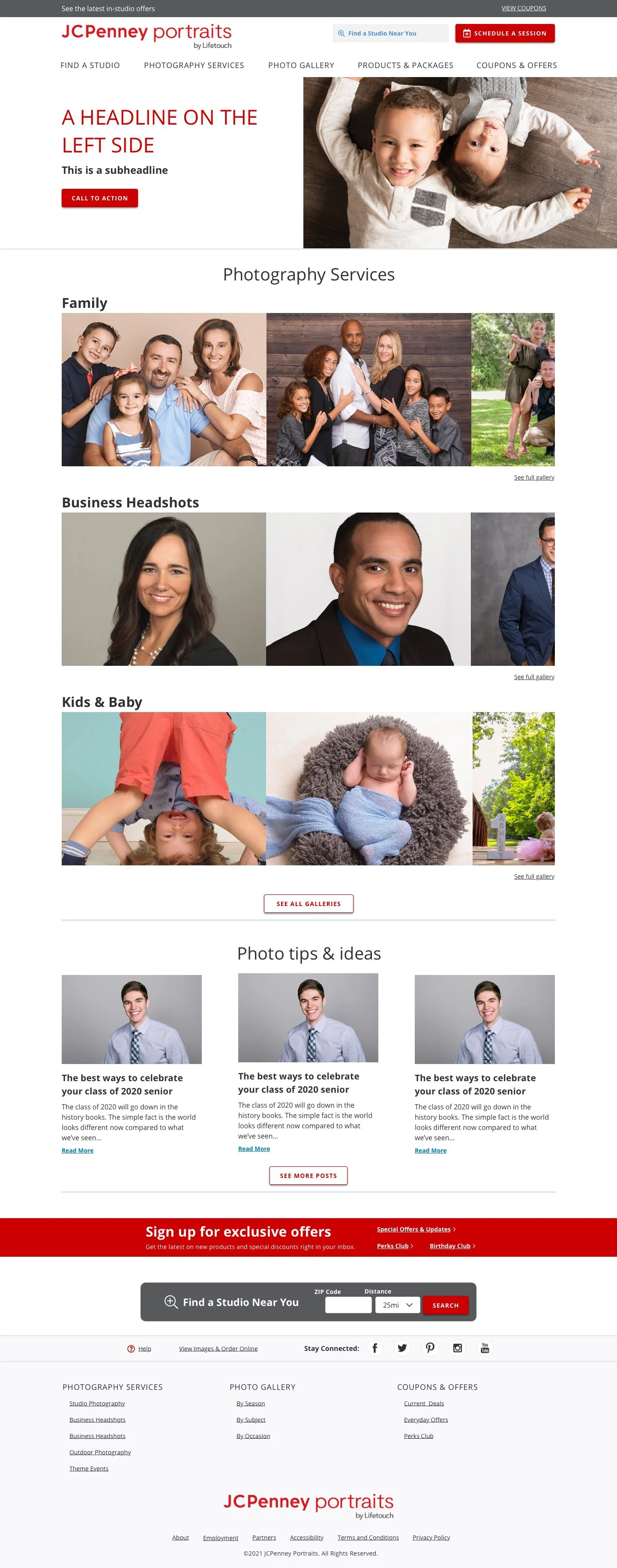
Photo Gallery Navigation: The Photo Gallery lacked directional UX and filtering options, making it difficult for users to navigate. Without links or filtering options, users had to repeatedly go back to the main mega menu, creating a frustrating experience and hindering user flow.


Project Goals
01 Increase Booking Rates
Boost booking rates by improving usability, especially on mobile devices, to ensure studio appointments are filled.
02 Simplify User Experience
Streamline the site to make it easier for customers to find studio locations and book sessions.
03 Enhance Offers Visibility
Create a clear and accessible Offers page to improve user engagement with promotions and facilitate bookings.
04 Improve Mobile Usability
Optimize the site for mobile devices to accommodate users booking on-the-go.
05 Enhance Photo Gallery Navigation
Improve the UX of the Photo Gallery to facilitate easier navigation and better user flow.
Project Execution
We validated our hypotheses against data sources to pinpoint high-impact areas. This included:
Checkout Funnel Fallout: Identified where users abandoned the booking process.
Shopping Cart Fallout: Examined cases where users added sessions to their cart but did not complete the purchase.
Access Fallout: Assessed difficulties in accessing the booking system.
Site Traffic Patterns and User Intent: Analyzed traffic patterns and user behavior.
Campaign Call-to-Actions: Evaluated effectiveness of promotional CTAs.
Analysis and Research Activities
1:1 Interviews with Stakeholders
Strategic Workshops
Competitive Audit
Brand Audit
Functionality & Results
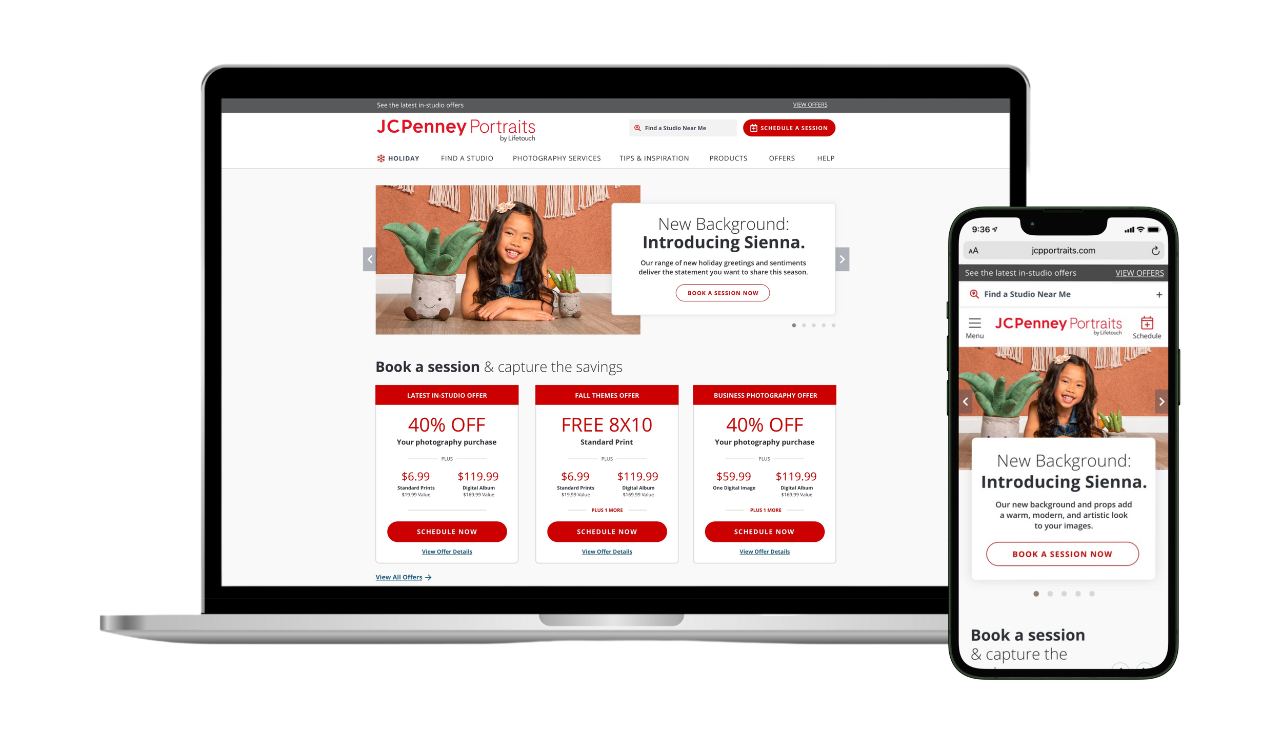
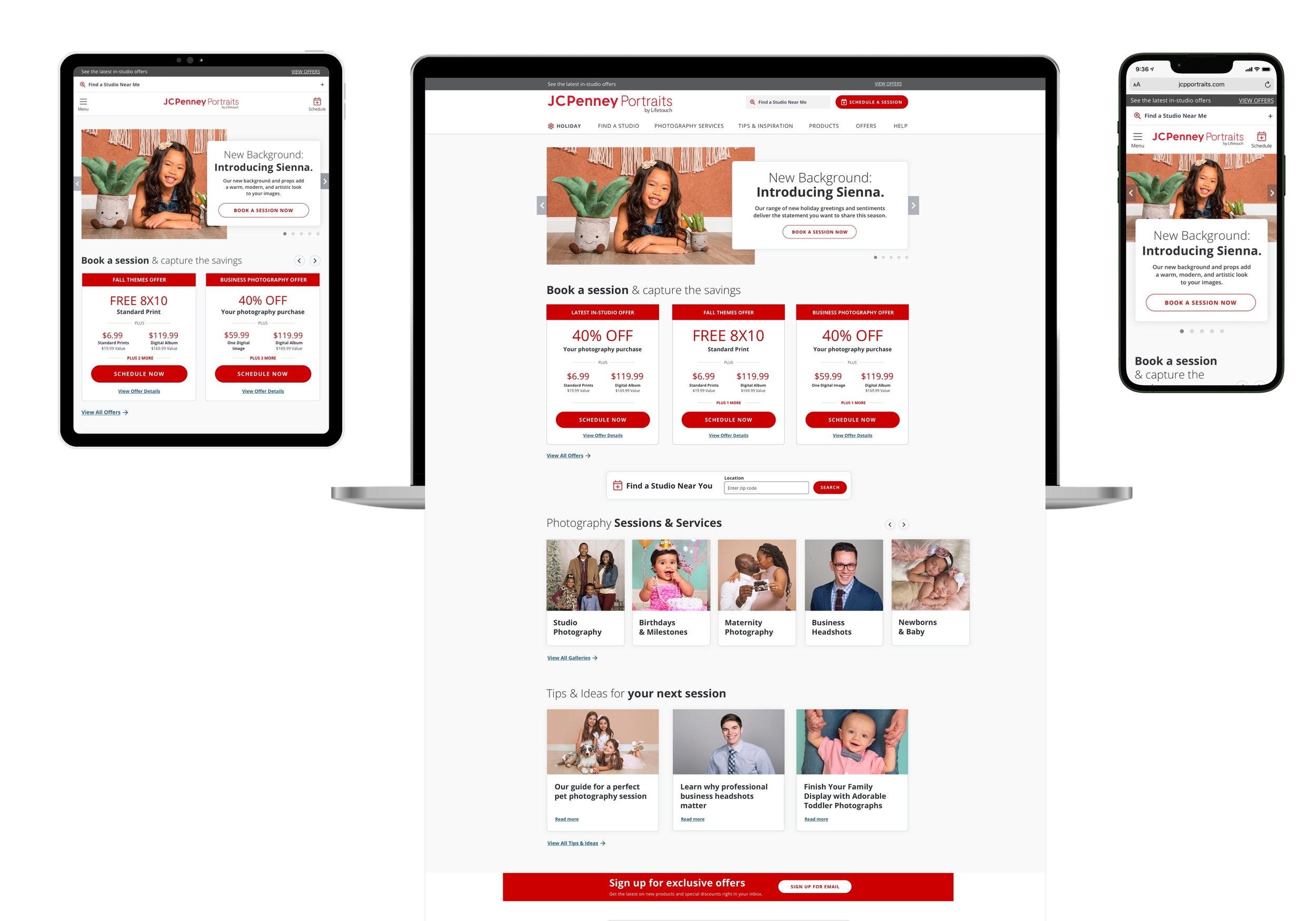
01 Optimized Homepage and New Landing Pages
Addressed mobile optimization and hierarchy issues to improve navigation and user engagement.
02 Enhanced “Find a Studio” Functionality
Redesigned the "Find a Studio" page with stronger CTAs to prioritize scheduling. We found that users were successfully searching for studio locations but were not taking the next step to schedule a session. By making scheduling the #1 priority, we guided users to complete their booking.
03 Introduced a New Offers Hub
Created a dedicated hub for all active offers, making them easily accessible and understandable. This change streamlined the user journey from discovering offers to booking a session.
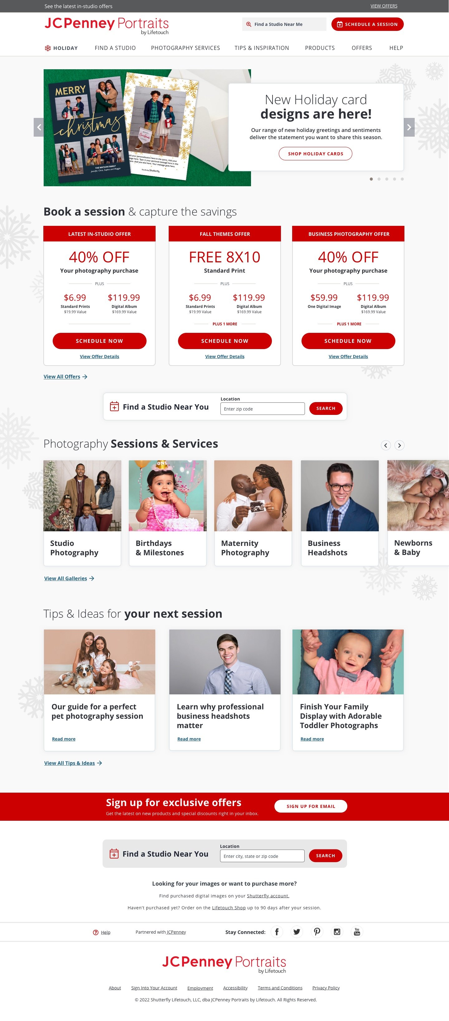


05 Revamped Photo Gallery
Designed a new Gallery template featuring side filtering options to help users navigate and explore different categories of images. Added a booking widget at the bottom of the Gallery page to allow users to schedule a session without having to leave the page. This improvement kept users engaged with the content and provided a seamless path to booking.
Additional Bonus! New Clean URLs for Gallery Pages
We also cleaned up and implemented clean URLs to enhance SEO and ensure accurate tracking of marketing efforts by retaining UTM parameters.
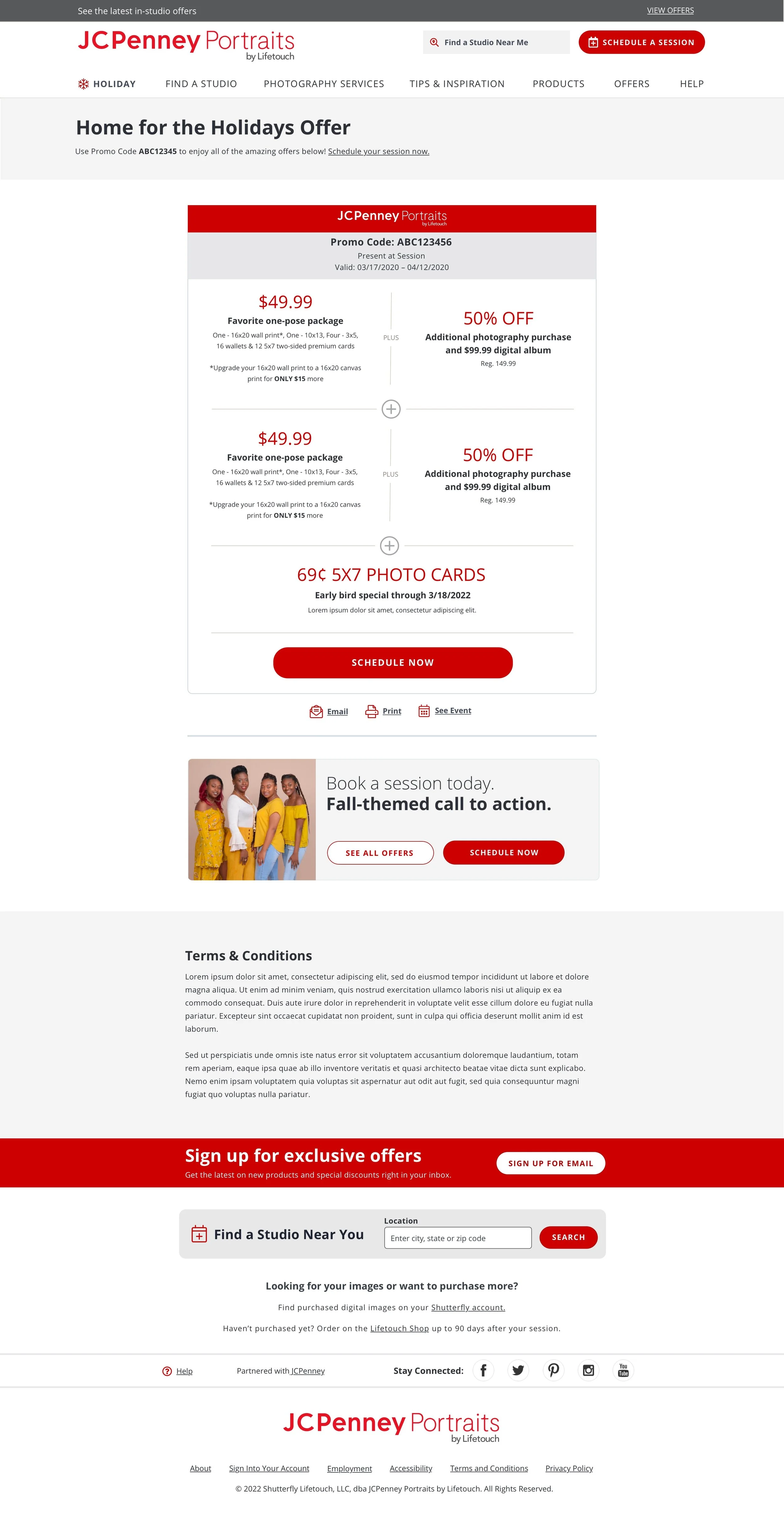
06 Revamped Offer Page Template
Updated to include a clear CTA and optimized for mobile. We hypothesized that by updating the Offers page to convey all offers as part of the same promo code, we would increase the conversion rate for JCP studios. An A/B test showed significant improvements:
Control Page: Schedule Session click-through rate of 28%
Variation Page: Schedule Session click-through rate of 37%
Bounce Rates: Reduced by 2.53% on the Coupon pages


How the Redesign Enhanced Usability
01 Streamlined User Journey
Reduced distractions and encouraged efficient scheduling.
02 Mobile-First Design
Ensured key functions like finding a studio and booking were accessible on mobile devices, accommodating users with limited or no wired internet access.
03 Clear Communication of Offers
Improved visibility and comprehension of promotions.
04 Enhanced Navigation
Improved the Photo Gallery experience with better filtering and navigation options.
05 Improved SEO
Clean URLs for gallery pages helped in better search engine optimization and tracking.
06 Enhanced Admin Panel to Empower Clients with Customization
The new admin panel allowed JCPenney to update offers and content independently, enhancing flexibility and reducing reliance on external developers.
Results

Booking Rates
Reversed a decline and achieved a 21% increase in booking rates.

User Experience
Improved site navigation and booking process and reduced bounce rates by 12%.

Operational Efficiency
Enabled quicker content updates and more agile marketing.