Revitalizing My.Lifetouch.com: Boosting Authentication and Engagement
SHUTTERFLY & LIFETOUCH

Project Summary
The My.Lifetouch.com platform serves as the central hub for K-12 Underclass schools across the U.S. and Canada, connecting families with their children's school photos. Through this platform, families can purchase picture day photos, as well as specialized digital and print products tailored to their needs. However, the previous version of the site faced several key challenges, particularly in user engagement and navigation. As the Product Design Lead, I was tasked with a small-scale revitalization of the platform to improve authentication rates, streamline the shopping process for parents, and introduce new features that would better serve Lifetouch's core customer base.
With a focus on improving the overall user experience and reducing friction at key stages, my team and I implemented a variety of strategic updates, including the introduction of auto-claim functionality, a revamped homepage, and a personalized student dashboard that enhanced both user engagement and conversion rates.
Problems
The key challenges that led to the need for this redesign included:
Low Authentication Rates: Many users were browsing without signing in, leading to lower engagement and reduced visibility into their available photo day events.
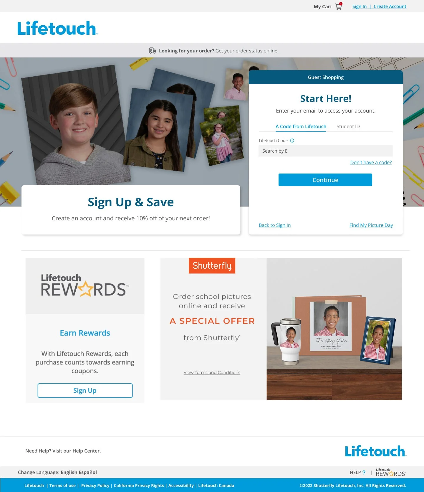
Reliance on Access Codes: The previous system required users to manually enter access codes, creating friction and increasing abandonment rates.
Difficult Multi-Student Shopping: Users shopping for more than one child found it cumbersome to manage separate orders, resulting in a poor user experience and lower conversion rates.
Lack of Personalized Experiences: The site did not offer a personalized dashboard to help users quickly navigate their children’s photo day events or take advantage of relevant offers.

Project Goals
01 Introduce Auto-Claim
By increasing the number of signed-in users, we aimed to foster more engagement, as authenticated users are typically more active and invested in the shopping process.
02 Reskinned Homepage
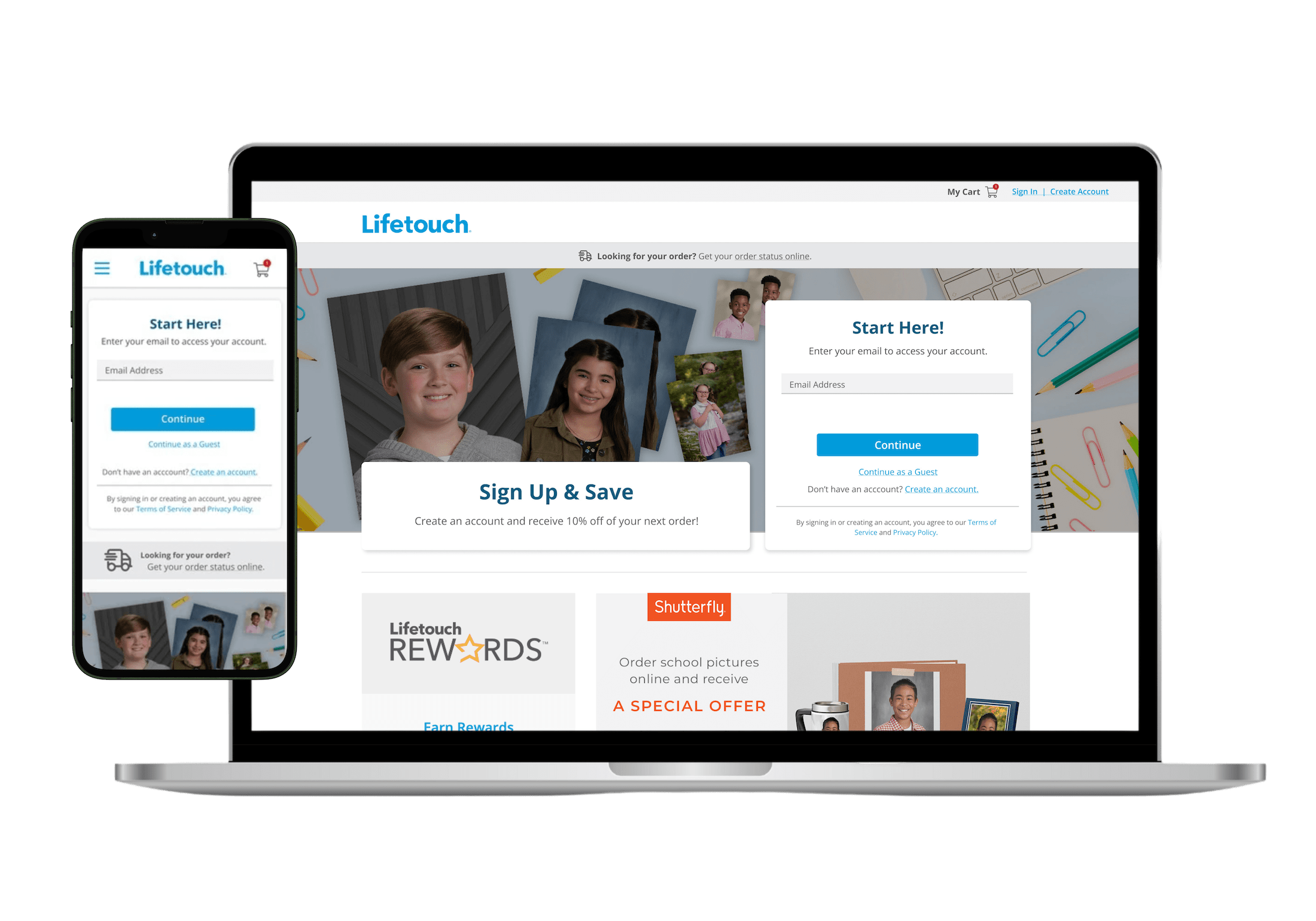
We focused on the top portion of the homepage to deliver key updates that enhanced the user experience, particularly at the beginning of the shopping funnel.
03 Launch New Personalized Dashboard
The introduction of the new "My Dashboard" feature enabled users to easily manage all previously claimed students and auto-claimed events, as well as add new students. The dashboard also served relevant offers, incentivizing users to shop for multiple children at a discount.
04 Implement Student Banner
This new banner worked in partnership with the dashboard to help users understand who they were shopping for and switch between different events. It also introduced new auto-claimed events to users, encouraging further engagement.
05 Facilitate Multi-Student Shopping
Previously, shopping for multiple children was a significant pain point. We introduced new features that allowed users to easily shop for all of their children in a single order, making the experience much more seamless.
06 Mobile-First Design
As the majority of users access the site via mobile devices, we implemented significant mobile-first improvements to ensure that the experience was as smooth as possible across all screen sizes.


Project Execution
We approached this redesign by diving deep into user behavior data and conducting a series of research activities. This included:
Data Analysis: We analyzed user authentication patterns and funnel fall-off rates to identify where improvements could make the most impact.
User Interviews & Workshops: We engaged with both customers and stakeholders to better understand pain points around multi-student shopping and reliance on codes.
Competitive & UX Audits: We performed a comprehensive review of competitors and best practices in the eCommerce space to design more intuitive solutions.
Analysis and Research Activities
1:1 Interviews with Stakeholders
Strategic Workshops
Competitive Audit
Brand, UX and UI Audits

Functionality & Results
01 Optimized Homepage and New Authenticated Landing Page
Addressed mobile optimization and hierarchy issues to improve navigation and user engagement.
02 Faster Access to Photo Events
Auto-claim functionality reduced the time it took for users to access photo day events, simplifying the process and eliminating the reliance on access codes.
03 Higher Multi-Student Shopping Rates
The improved process made it easier for users to shop for multiple children, leading to an increase in multi-student orders and boosting overall sales.
04 Enhanced Mobile Experience
With mobile-first improvements, users enjoyed a smoother, more efficient experience when shopping on mobile devices.
The new experience simplifies photo shopping and creates a seamless, personalized shopping for families.

Results

Improved Authentication Rates
Reversed a decline and achieved a 15% increase in authentication rates.

Enhanced Mobile Experience
Improved site navigation and student claim process, with mobile users top of mind.

Operational Efficiency
Enabled quicker content updates and more agile marketing.
